Step 4: Analysis
Now that we have extracted the biome classification and the water deficit in the first epoch for our lake points, we can import them in R and start the analysis
#loading the data: adjust the path name and the file name to your specific file:
lakes_deficit80s <- read.csv("G:/My Drive/lakes_deficit80s.csv")
lakes_biomes <- read.csv("G:/My Drive/lakes_biomes.csv")

# is lake salinity higher when water deficit is higher? Plot this graph, and adjust the labels of the axis
plot(?~?)
This should look something like this:
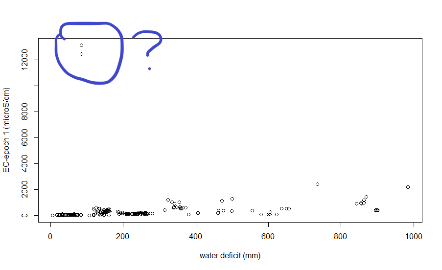
There are indeed two outliers here: identify which points these are: you can do this in the console, simply by selecting those points in the database which have a very high (let’s say 4000) EC.
lakes_deficit80s[which(lakes_deficit80s$EC19801990>4000),]
where are these points located? Look up the coordinates. Would it make sense to remove them from this analysis?
Let’s indeed remove these two points from the database for now. It’s easiest to make a new database, which is the same as the lakes_deficit80s database, but only contains those elements where the EC is lower than 4000 microS/cm. Based on the command above, you should be able to complete the code below:
lakes_deficit80snew<-?
Similar as what we have done in practical 2, let’s build a simple linear model with y = the EC in epoch 1 and x = the water deficit (why not vice versa?)
linearmodel<-?
summary(linearmodel) #does the water deficit explain much of the variation in the EC? is water deficit significant?
plot(?~?) # plot the two variables again
abline(linearmodel, col="red") #add the regression line
now, in which biomes are the lakes situated with the most increase in salinity?
This is slightly different from the plot/model above, as biomes are a categorical variable (they represent different classes). A way in which we can visualize this is to plot the difference in salinity for each biome seperately in a boxplot:
#now which biomes have seen increase in salt?
boxplot(lakes_biomes$DIFF~lakes_biomes$mode, outline=F)
abline(a=0, b=0, col="purple") #why do we add this line?
All lakes in biome 13 see an increase in salinity. Which biome is 13? How many lakes are there in this biome? Where are they located?
The biome codes can be found in the data catalogue in GEE when searching for the original dataset we used to extract the biome information (openLandMap).
To find out how many lakes are in biome 13 and where they are located, let’s first filter them out. Based on the codes above, you should be able to complete the code below:
biome13<-?
In R there is also quite some nice visualization possibilities: let’s plot the points on a open street map background and color the dots according to the difference in salinity.
#install.packages('leaflet')
library(dplyr) #install.packages("dplyr") if your version of R does not have it installed yet
library(leaflet) #install.packages("leaflet") if your version of R does not have it installed yet
library(viridis) #install.packages("viridis") if your version of R does not have it installed yet
pal <- colorNumeric(palette = "YlOrRd", domain=biome13$DIFF)
leaflet(biome13) %>% addTiles() %>%
  addCircleMarkers(lng = biome13$X,
             lat = biome13$Y,
             color = ~pal(biome13$DIFF))
The resulting visualization should look something like this:
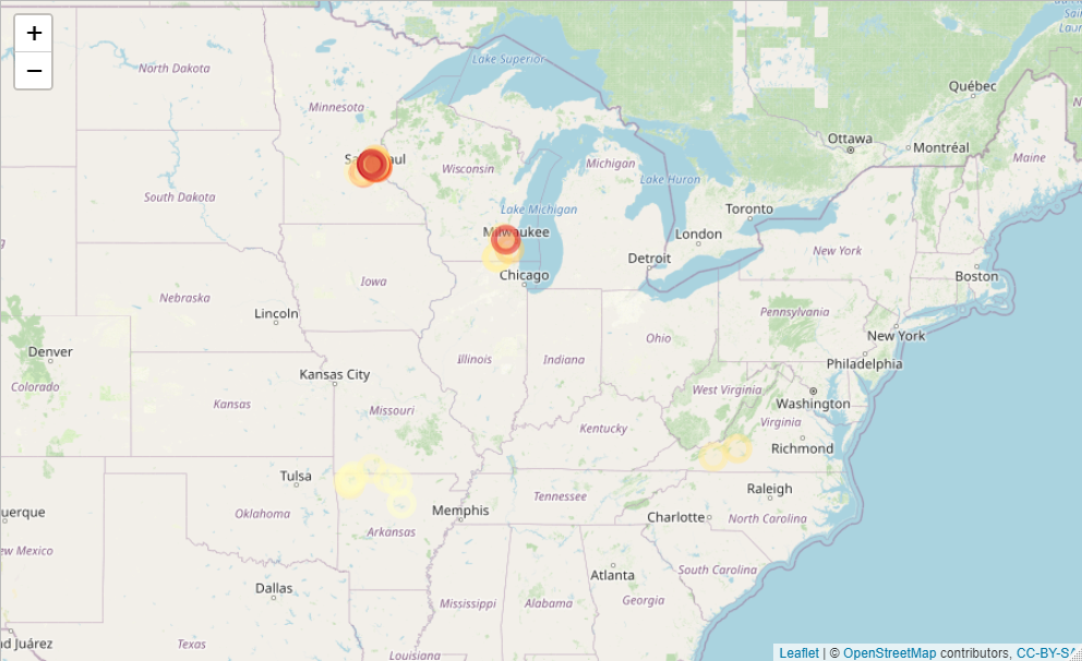
You can zoom in and out in the ‘Viewer’. The region around Saint Paul-Minneapolis seems to be most affected by an increase in salt. Find out why… (tip, use google scholar and search for e.g. ‘saint paul minneapolis salinity freshwater increase’).
What happens in the lake which has seen the largest relative increase in salinity?
Let’s find the lake which has seen the largest relative increase in salinity, and plot the entire timeseries for that lake, so that we can visualize how this change in between the two epochs actually happened:
#first let's calculate the relative EC changes: put this information in a new column
biome13$reldiff<-biome13$DIFF/biome13$EC19801990*100
#then we can find the ID of the lake which has the largest relative difference:
maxlake<-biome13$ID[which(biome13$reldiff==max(biome13$reldiff))]
maxlake

#now let's load the entire dataset (Lakes_Reservoirs_database), and filter out all measurements for this lake:
#select that lake in the big dataset
measurements_maxlake<-?
#we need to tell R to consider the Dates as actual dates (and not, e.g. a character).
measurements_maxlake$Date<-as.Date(measurements_maxlake$Date)
#and then we order the dataset from earliest to latest measurmeent
measurements_maxlake<-measurements_maxlake[order(measurements_maxlake$Date), ]
plot(x=measurements_maxlake$Date, y=measurements_maxlake$EC, type="l")
When dit this increase in salinity start? Now we could go even further and investigate if this increase indeed coincides with increases in national road deicing or salinity import… check fig 5.1 here
But… you also made it to the end of this practical. Congrats!